Researching the Company's name and branding…
This is not as straightforward task as I thought it to be. In the beginning, I thought of dedicating the business name to my wife and calling it “My Beloved Sarah”. But then I realised the acronym ends up as MBS and might misrepresent as Marina Bay Sands. I wanted something that really means deeply to the concept of how the recipes come about.
Hence, I come up with a drawing board to list out all the key values of this business. I registered words like simplicity, fresh ingredients, unique, 3 degrees of flavouring, perfection and even complexity. Eventually, I narrowed down to the following terms, complexity through simplicity, refine and unpretentious, savoury and unsophisticated, extraordinary from the ordinaries. That is when google search comes in. I wanted a word that speaks out these meanings, and being a fervent learner of Japanese culture and cuisine, I thought my chances of finding it in Japanese will be a good start.
Praise the Lord, I was led to this word, “Shibui”. The word that really shouts out to me is from a best-selling novel back in 1979, titled “Shibumi” which quoted “Shibumi has to do with great refinement underlying commonplace appearances.”
In another book titled “The Shibumi Strategy”, the author quoted “Shibumi has come to denote those things that exhibit in paradox and all at once the very best of everything and nothing: Elegant simplicity. Effortless effectiveness. Understated excellence. Beautiful imperfection.”
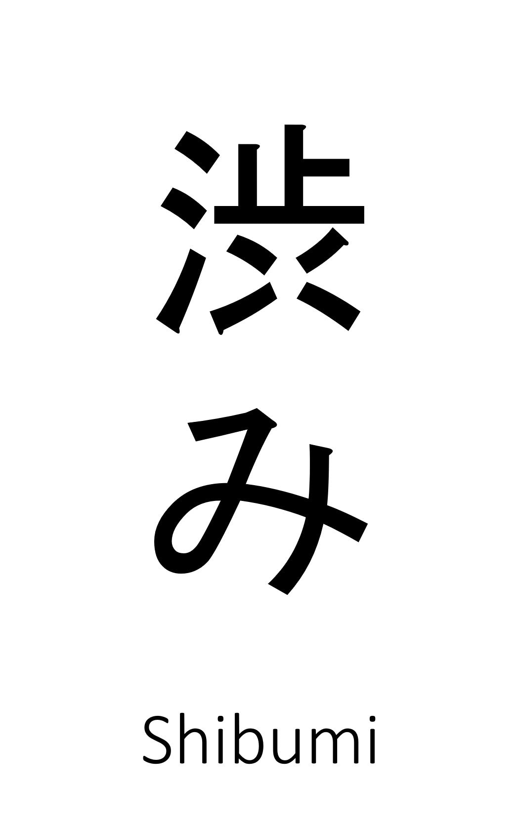
I even bought the books to read so as to have a deeper understanding of this word. And the more I understand the meaning behind Shibumi (渋 - shibu み - mi), the more I fall in love with this word. It correlates to the heartbeat of what I am creating. That’s how the business name comes about – Shibumi with the slogan “Perfection in simplicity”. The slogan is finalised by my wife so I must give her credit here.

But this is not over yet, wording without the right design can give different impressions. Good thing this is more towards google search effort and testing out various designs to fit the meaning. It has to be artistic and artisanal in a clean-cut design without being loud or complicated, yet classy in style, light hearted, but not kiddish. Being a Japanese concept brand name, I have to respectfully find the design more inclined to the meaning as well. At the same time, I dreamed that one day my home-based business will become a brick-and-mortar outlet, a place that is clean cut, simple, Zen style ambience and yet casually formal.
After much search, I finally decide on this font called TA-Hanagasa, a hand-written brush font by Japanese brush calligrapher, Hideo Miyagi. The word Hanagasa (花笠,はながさ) also carries a beautiful meaning, “it represents a type of conical hat adorned with flowers (used in Japanese traditional performing arts)”. The meaning in a way, corelate to the heart of the slogan as I pictured a bouquet of various flowers that bring a balance of aroma and flavours. I really like the design and meaning behind it and yes, the branding concept is coined.